Building powerful one page website for Japanese Food Truck.
Scope of work.
Modern, SEO optimised, responsive and brand focused WordPress website
Logo and branding
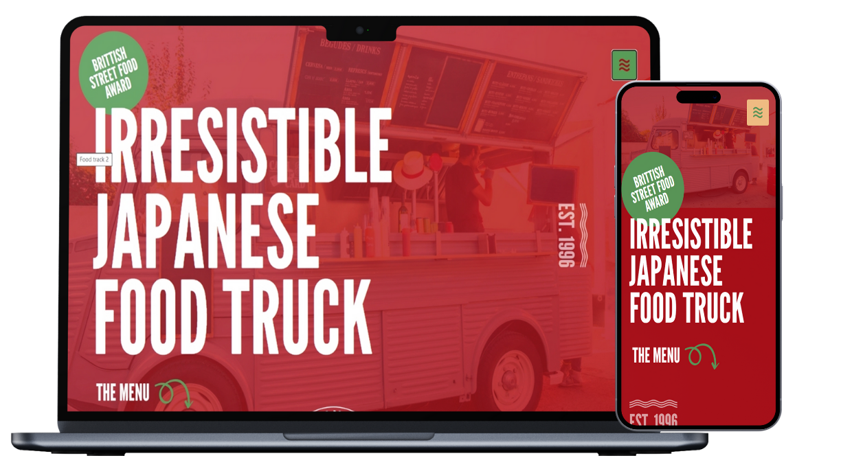
This project showcases a vibrant, youth-oriented website design for a Japanese food truck brand. The red and white anchors the design and subtly references the Japanese flag, creating a clear visual link to its cultural roots. The hero section, with its bold red background and clean white typography, delivers an immediate connection to Japan while maintaining a confident, modern look.
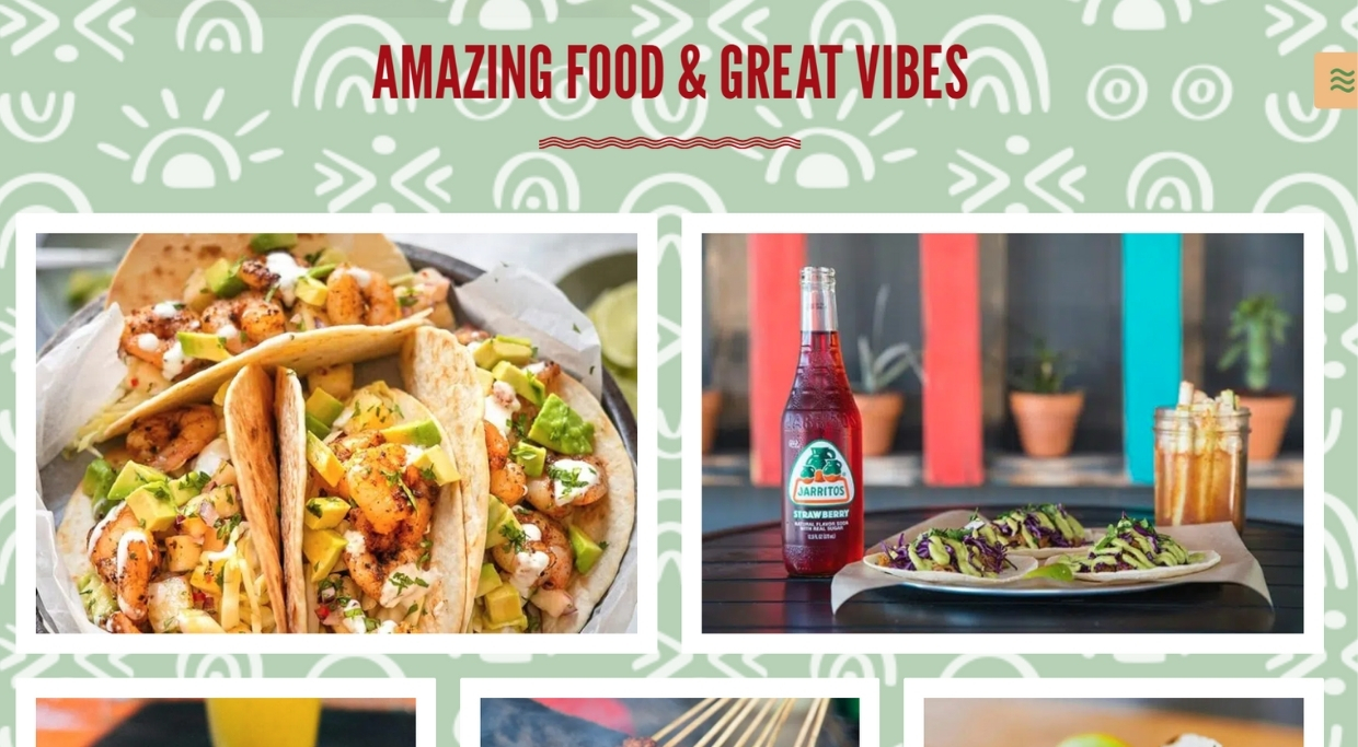
Green reflects the freshness and plant-rich nature of Japanese cuisine. Brown grounds the design, evoking natural textures and the warmth of street food culture—think wooden tables and earthy tones. Orange adds a lively, social energy, representing the excitement and warmth of shared food experiences.
The overall design is colorful and dynamic, aiming to capture the casual, energetic spirit of street dining while remaining distinctly Japanese in mood and aesthetic. It’s approachable, bold, and crafted to appeal to a younger audience seeking authenticity with a modern twist.