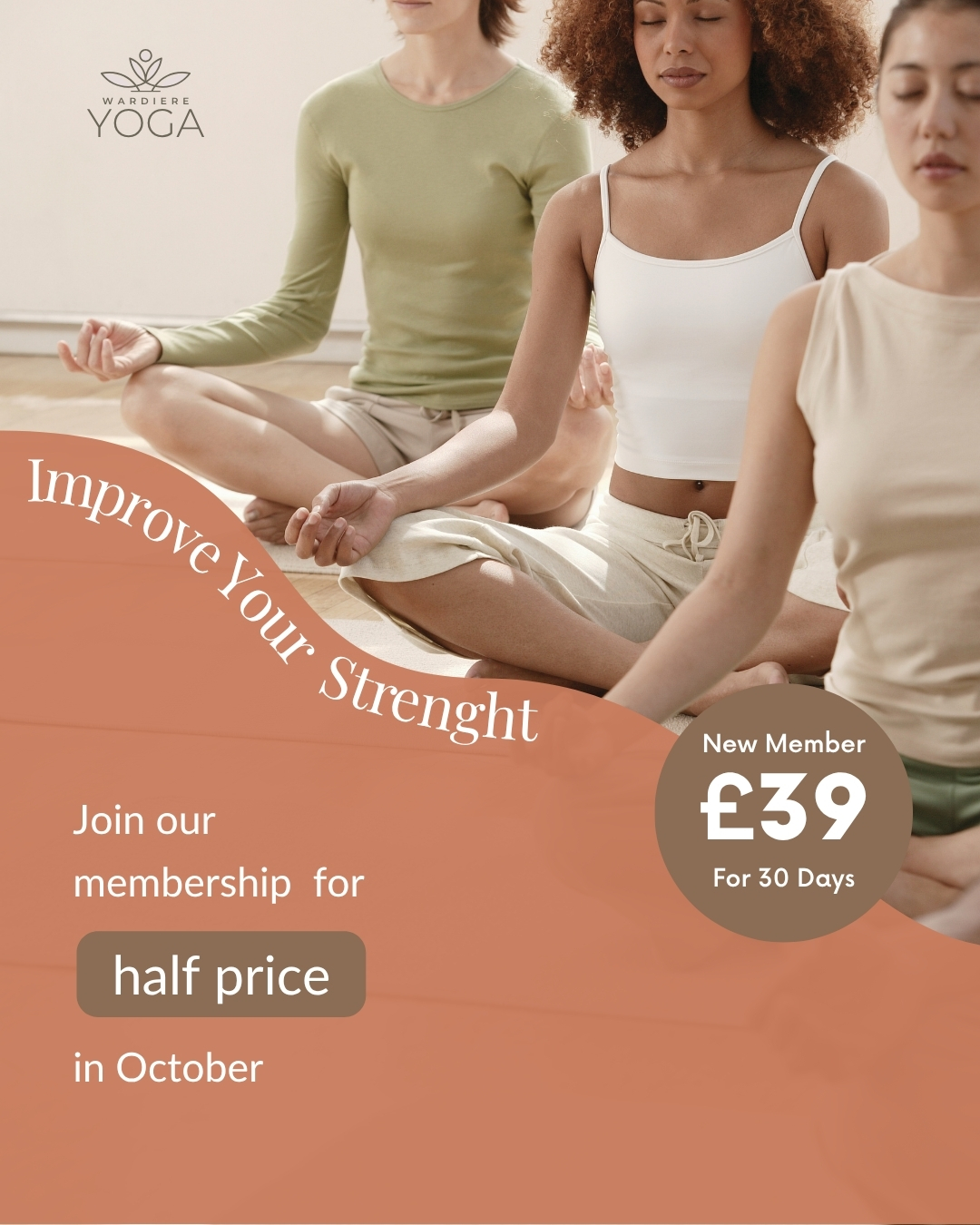
Building powerful identity for Yoga studio (sample work for portfolio).
Scope of work.
- Modern, SEO optimised, responsive and brand focused WordPress website
- Sample of social media posts align with the brand colours and mission
- Showcase how color can shape mood and perception within the same design framework


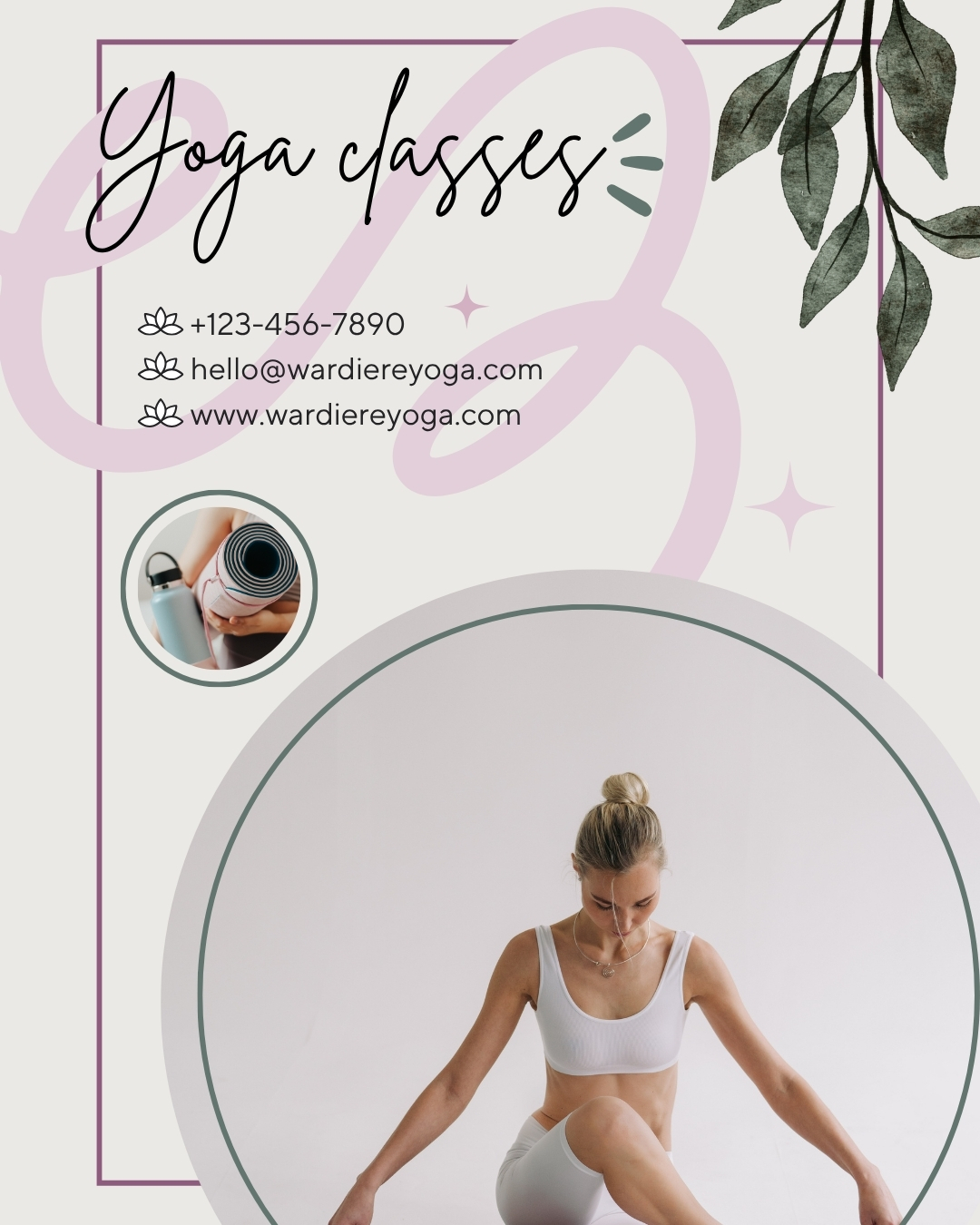

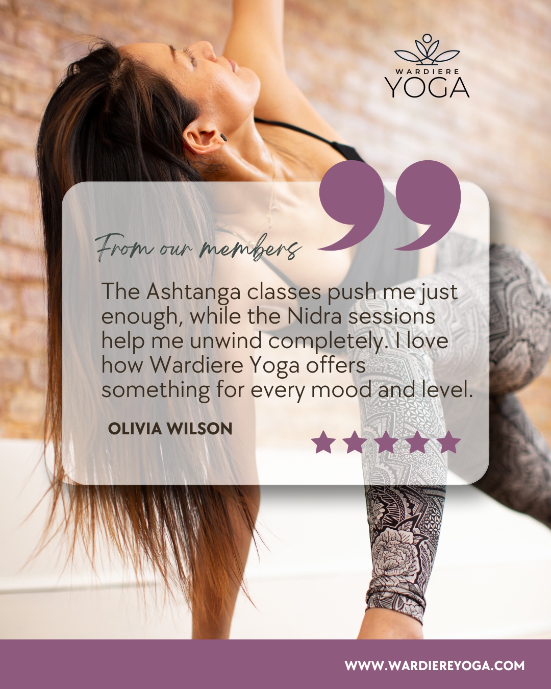
This project showcases how colour can shape mood and perception within the same design framework. The top palette – a mix of cool greens, soft neutrals, and gentle mauves conveys calmness, clarity, and a sense of quiet balance, reflecting the meditative side of yoga. The warm palette (below) introduces earthy browns, sandy taupes, and terracotta accents to evoke natural warmth, grounding energy, and a feeling of connection.
Together, these two versions highlight how subtle colour shifts can express different aspects of the same brand identity—both serene, both centered, yet uniquely atmospheric.